A group of Second Year De Montfort University students studying Game Art Design.
This blog is to document our participation in the 'Off The Map' competition from Game City, Crytek and The British Library.


Is It Over? - The Final University Hand-In And Flythrough

Final hand-in has happened....

It's been a long road so far and looking back at how far we've come... well, I'm amazed. I thought I'd keep you guys all updated with our new and improved flythrough of the level. 


Of course, handing this all in to university is only half the battle. In fact, not even half. We've got until August to improve this bad boy and I plan on making use of that time. Of course, there are so many things within the level that still need tweaking and changing. There are new areas we'd like to add, more population to do, more assets to create.

Okay so, first, lets look at what we improved on:

- Thunder and lighting. They add so much atmosphere to the level and they really helped to showcase the house. Before it was very much a silhouette but now you can really see the detail and work that went into it.

- We nailed the atmosphere. The lighting worked fantastically and we definitely captured the "gothic" mood throughout the level.


-There is a sense of continuity and consistency. The style is very consistent and really bring the level together. 


- The composition of the graveyard is beautiful and isn't what you would typically think of when you hear about a Gothic graveyard. 


- The Hallways have been beautifully populated and feel inhabited, my like the rest of the house. It feels as though someone is in there. 


Now, why we are pleased with the level, we aren't blind to the problems that are present:

- We have far more variations of gravestones that we haven't put in yet. We need to include them to up some variation.


- Although I fixed the lightning flow graph, it completely doesn't work in the editor now I've reopened it. I need to figure out how to stop this from happening. 

- Our unfortunate and unintentional Mandalay reference is our gate without collision. We need to play through the level a little more and figure out if there are any more issues like this and then sort the collision out. 


- One big problem we all agreed on is that the literary references are not as obvious as we would like. We had made a concious effort to try and keep it subtle, but at the moment it is too subtle. Within the Frankenstein room we are going to need to include some references to Stuttgart and some more science-themed assets.


- The red lighting in the Poe room, while it looks good, needs some kind of source. A fire place may fix this.


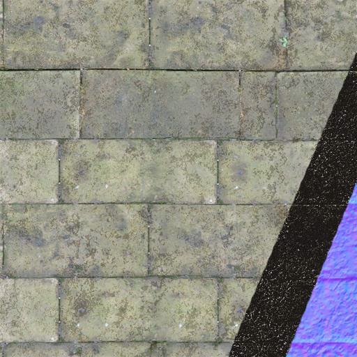
- There are a few texture issues that we will need to fix throughout the level. Some may need to be redone to make them higher quality and fix any problems with them. 

- More population is needed. Although we have achieved a lived in feel, there is more we can do. Especially within the courtyard.


- More density when it comes to the trees along the edge of the level. It needs to be more enclosed. The fog helps to hide the fact that this is in a small area, but we need more to solidify it. 

There are so many things that we want to continue to improve and add. For example, the Frankenstein room is going to hopefully have a huge overhaul; we will be expanding it upwards by a floor and adding a laboratory area to it. The courtyard statue will be completely changed to reflect the three sisters from Dracula and we will be adding extra room. 

The garden area outside of the house is very empty also. There needs to be something more there to stop any kind of disinterest from the player. If they choose to explore, then there needs to be something to draw them and excite them. Some more foliage or an extensive gothic garden may be the perfect plan. 

There is a lot more work still to come. Check out our project on Crydev as well.

-Hannah

Are We Eyre Yet? - A Review

HIYO! Back on form!

It’s time to have a review of our level and go through with a fine toothed comb. It’s a list of critiques from ourselves, peers and also tutors that need working on before hand in.


- The texture used for the gate entrance is muddy and bland. It needs to be spiced up with decals or changed completely. The lamps on the entrance merge into walls; they need handles to protrude from the wall. Also the candles flicker at same time which distracts.

- When looking through the gate the house can’t be seen. It always needs to be if it is to be the overbearing presence we want it to be.

- I fear it isn’t obvious enough the player needs to go left at gate and so could frustrate.


- There need to be more lamp variations and also the graves need to be able to be read. Something needs to replace the rocks in front of the graves.

- More needs to be made out of the cliff view. At the moment it’s not obvious it’s a cliff scene.

- We are in need of more vegetation variation to dot around.


- We need to implement the thunder in order to see the house, hard work was put into it and at the moment it’s just a silhouette.

- We don’t want to waste the players time, There’s nothing stopping them going into driveway area.

- At the moment the walls of the building are dull, they require decals.


- The ivy in courtyard is tiling and at the moment the area is sparse. Perhaps include benches etc or temporary statues.


- In the entrance hall the glasses on the table are very blue and quite distracting.

- The painting is clearly stretched and needs refining. The transition of the painting is too subtle; it really needs to be stand out feature of this room. There is also a large space in front of painting needs filling, candle holders, furniture perhaps.

- Perhaps most of all there is no obvious colour theme to this room nor literary reference. This is what our level is about and at the moment it is a waste of a room.


- The corridors make for quite a boring journey; the walls need to be filled with masks, paintings or decals.


- The posters in the Frankenstein room are emitting their own light; they are also far too neat, being perfect rectangles. The silhouettes need tweaking a bit. More green needs to be added to the room, we need to add leather on desks, green creatures in cabinets and more green lighting, the room is far too dark at the moment.

- We have lost focus on populating the rooms with literary references. WE know it’s a Frankenstein room, but how does anyone else know? We need to include loads of subtle references nodding to the fiction: names, locations etc.

Let’s keep this going guys!

-Luke

The Doctor's Lair: Frankenstein's Room

Beside of 'The Masque of Red Death', we also decided to relate to other pieces of gothic literature and authors. We all agreed that one of the most iconic gothic books is Mary Shelley's 'Frankenstein', so we felt that we should include some references to that book.  Therefore, we decided to turn one of the seven rooms from Poe's story into Dr Frankenstein study room.


We didn't want our references to be too trivial so, we decided not to go for the cliché vision of the room including things, such as Tesla's coil and stitched body parts. Instead, we wanted to give the player small hints that would enhance atmosphere and would indicate that this is Dr's room. Therefore, we populated scene with items such as anatomical drawings, surgical tools, many books, shelves, and flasks.


The only objects that could be seen as a bit over the top are jars filled with strange creatures. After all, Frankenstein is regarded as one of the first science-fiction books, so we felt that we needed to add some paranormal accents.


One of the crucial, yet more subtle, references to the book which is likely to pass unnoticed by an average player was the lightning hitting an Oak, which can be seen through the window. It was an important scene in the book as this was when Dr came up with the idea to bring a corpse back to life. We believe that it adds value to this part of the level.    
Also, we created a range of furniture pieces that were especially designed for this room and were not repeated in any other area of the level.


Despite the fact that the hints we included are quite subtle, we hope that it won't be too hard to figure out the references to the book.

-Karol 

Grave-ly Underestimating... - The Graveyard

...how long this would take me. Not all my puns can be great, nobody’s perfect.

In our level we hope to include a graveyard in which you walk through before entering the main manor house. Unlike the conventional gothic graveyard that comes to mind, we wanted ours to be a serene area where the individual would take time to advance and take in the atmosphere.

I conducted a few field trips to visit some graveyards in Leicester to get a better understanding of what it was I was going to model. It helped me immensely by gathering textures, understanding materials, scale, shape and also layouts.


An idea which was brought up was to have names on the gravestones depicting a gothic character in literature or film. Whilst this was the initial plan we didn’t want the reference to be glaringly obvious and gimmicky. There’s not much subtly in ‘DRACULA IS BURIED HERE, OH MY WASN’T HE GOTHICY’.

Instead we opted to use a piece of text to depict the character and then above, graphic imagery relating to a key symbol within the novel. As our level is filled with clever gothic references we hope keen fans of the literature will have a field day within the graveyard.


-Luke

Holy Moliage! Check Out That Foliage!

Come exterior, come populating, come foliage. Having undertaken the job of foliage artist I have become painfully aware how naive of me it was to assume you could dab a few trees here and there to create a credible landscape. It makes for a baron looking scene and an unconvincing one at that.

Not short after coming to this revelation we received a presentation from several members of Codemasters outlining their tree, rock, grass method for environments. They explained how it is naive to assume you could dab a few trees here and there to create a credible landscape. It makes for a baron looking scene and an unconvincing one at that. At the very minimum, rocks and grass are added to the scene so that you don’t have an idle tree residing in the middle of nowhere.

It soon became obvious that there was no easy way out of this one if we wanted a lush exterior. As our level is made to be on a cliff, research was required as to what would grow on the coast line of Great Britain. I doubt coastalgardening.com has ever had so many hits. It is also very important that a gothic mood is ever present when navigating the level, a mood which is diminished if vibrant and distracting colours are dominating the scene.

A decent amount of diversity is needed; nothing is more obvious than a repeating pattern or asset within a scene. This has been mainly countered with multiple variants of a similar asset, for example varying heights, colour, mass etc. We have included numerous rocks, plants, trees, grasses, bushes and ferns with still more to add in order to produce a captivating exterior.


It is very easy to over populate when you have a number of assets that need placing within the level and not much of a plan as to where they should be placed. This is where you have to take a page out of someone else’s book, begrudgingly sometimes you have to admit that someone in the past has probably done it better than you and that is why they receive a salary for it. When researching games to take inspiration from I mainly referenced Tomb Raider, as it had been done so well and Alan Wake, for the atmosphere the environment it evoked.

It taught us that a little went a long way, that whilst there was a great degree of foliage present, they were optimised composed subtly to make for a striking scene.


-Luke

We Built This City - The Exterior Modular Kit

I have been given the task of creating the exterior of the manor house, which is music to my ears, because I find modelling and texturing architecture fun.

I started the process with much research, mostly taking reference and inspiration from our visit to Wollaton Hall in Nottingham. Wollaton Hall was originally designed by Robert Smythson and built for Sir Francis Willoughby in 1588. The fact we went an explored an existing manor house made it a lot easier to make those important design choices, because we already had an idea of what we could achieve and more importantly what textures and modular pieces we needed to achieve it. Subsequently I began to dissect the construction of Wollaton Hall, to enable me to see what artistic choices the architect had made to make this manor house look so beautiful.


It took 8 years to build Wollaton Hall, but only took me an hour to tear it apart. After I had exploded the construction of the manor house and laid it out onto paper, I could see how its creator, Robert Smythson, had thought just as modularly as I do when creating a building. Instantly you see the symmetry and the uniform placement of windows around the buildings facade. Doing this process
allowed me plan what modular pieces I would need to create something similar and also see the technique behind window placement, because the windows are about 50% of the building itself.

To begin the process of modelling my own modular pieces I recreated Wollaton Hall in 3ds Max, with the exception of the space at the front for a courtyard we wanted to include. Doing this helped me to get an idea of scale, which was a difficult thing for me to comprehend at this early stage, as what ever I decided to make for the exterior had to match up with the interior my team members were designing. So shortly after we came to the agreement that each piece should be 3 Cryengine unit long by 4 units tall. Which I believe in Max is 3 meter by 4 meters.


Deciding scaling units allowed us to makes sense of the relationship between interior and exterior, and also allowed the interior designers to come up with this floor plan that housed everything we needed to display for the inside of our manor house.


Having the interior floor plan made, meant that I could create the exterior floor plan around it and judge how many modular pieces the building was going to need, and also judge how the windows could be placed symmetrically and line up with the rooms inside. 

Now I knew where the windows should be placed and how many I needed to make I could begin to concept how I wanted them to look, and to do this I used a model of Wollaton Hall to quickly help my vary and modify window designs.


After a group meeting we decided on the windows featured in concept 4, as they appeared more gothic due to the arched aesthetic of them. However I liked the circle window featured in concept 2, so I also carried that specific window across into the final design.

Once the windows had been concepted, I moved onto the final block out of the building using our 3x4 pieces to build up a realisticly scaled manor house. I made it so that the bottom of the building has a 2 unit high concrete base the allows the interior to be the same level as the patio entrance and courtyard. Unlike Wollaton Hall, which has 3 floors all round and then an extra floor because of its centre tower, my building has 4 floors all round and no centre tower, just a flat roof. I did this to save time, because adding another floor all round meant just copying the floor below and adding it to the top with different windows. Creating a centre tower would have meant creating unique pieces to build it.


The manor house itself is used as more of a cloak than a fully fleshed model. It needed to be able to house the courtyard someone else was building and also fit realisticly around the interior floor plan, to make it seem like there is more inside the building than there actually is. I knew the roof wouldn’t be able to be seen from player height so that wasn't a big worry either.

It wasn't long after I made the block out, that I started to work through each place holder square and come up with a  modular piece that would sit pretty in its place. We even worked out early that I needed to leave a one unit gap in between each floor to compensate for the 1 unit high floor the goes in the interior, and for this gap I made 1 unit high trim to cover it up.


Creating each modular piece was a long process as I was making design choices I went. Something I would definitely approach differently If I were to do it again. However I was pleased with how I had made it and each piece fit the job perfectly. After making the pieces I revisited each one and removed certain faces you wouldn't be able to see from player height which saved us a few tri's.


After I had unwrapped everything, texturing the Manor house was relatively simple. This was mainly because I could use tileable textures to get a quick spread of texture over every modular piece, which began to tie the architecture together, and made it look more like a manor house. 


With the textures of the manor house, I did some research and looked into what type of materials would have been used to build them, and how I could represent that surface and material type through my textures.


-Jak

Playing with Legos - The Interior Tile Set

After the planning that we put into the modular pieces and all the measurements and blueprints we drew out, we needed to make sure that everything fit together; we didn't want that planning to go to waste. Our 300x25x400 measurements worked out well in Cryengine, so we could get one large wall tile with enough height to give a sense of the grandeur that we experienced at Wollaton Hall.


The modular pieces we needed for the interior were not quite as extensive as the exterior, but still important none the less; with the exterior we can get away with a few mistakes, but the interior you're always up close and personal. Mistakes will be noticed. I was put in charge of the hallway and courtyard areas so it made sense for me to manage the interior tile set as well.
We made 14 different pieces for the interior tile set and a load of textures to go along with them.
The courtyard pieces took the longest to make. Using symmetry and boolean I was able to create the windows I wanted following relatively closely to the concepts I'd designed. I did the same for the courtyard upper windows. Building the white box in Cryengine definitely helped me figure out how many pieces we'd need and which


I decided to express some of the gothic architecture within these pieces; big pointed arches and intricate patterns were defining features. For the texturing we stuck with the exterior stone wall, meaning it looked cohesive.


The interior, however, was something we could have more free reign with. I originally had a stone block texture for the hallway pieces, but the texture itself was too aggressive. In fact, it didn't make sense within the context of the level; it's a manor house, not a castle.

Going back to the reference images we had from Wollaton Hall, I decided on a white/cream stone/plaster texture. Much smoother and more neutral texture which also harkened back to "The Shining" reference.


Once these were all made, it was simple to block out the shell of the level and it was very satisfying to see it all come together.

-Hannah